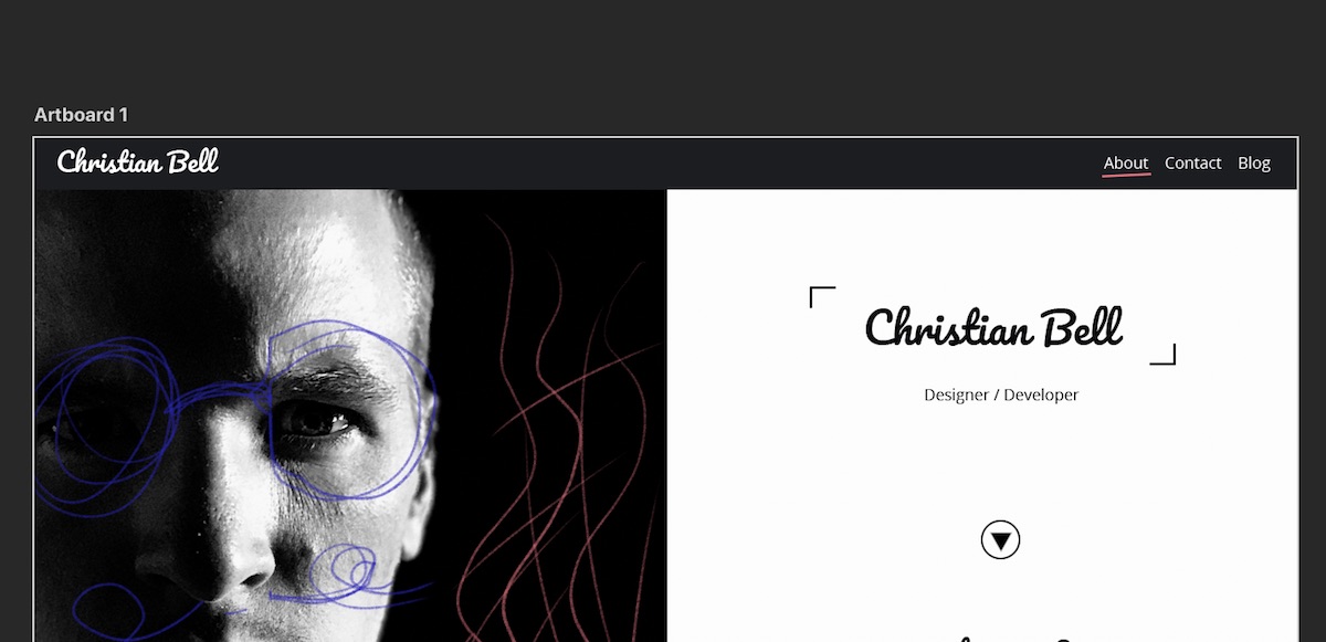
Welcome to my new look website!
I wanted to create something markedly different and with a bit more personality than many of the other web and design portfolio sites out there, whether or not I achieved that is not up to me to say.
The idea was that the desktop version would have an almost magazine-like appearance, the two-column layout bringing to mind a glossy double page spread, whilst the responsive mobile version would have the feel of an app. It wasn’t a format I’d really worked with before so it was a bit of an experiment slotting it all together.

